2017’s Top 5 Best Google Font Combinations for Website Development
The integration of web fonts has always been one of the largest contributing factors to diversity in the overall look and feel of websites today vs. yesterday. Fonts, just like images, play an important role in helping a website’s overall design stand out from the competition. When Google announced they were joining the web font game with Google Fonts, it was a game changer; it simplified the often complicated process of converting and embedding web fonts. We love and embrace Google Fonts and wanted to share some of our favorite Google Font combinations to help you improve and simplify your website development process in 2017.
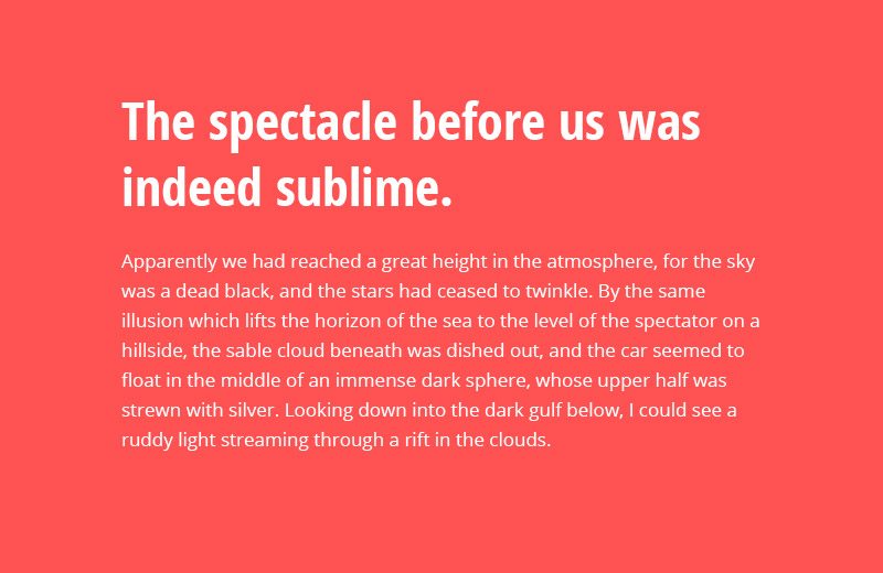
Open Sans Condensed and Open Sans
Open Sans is probably the most widely used Google font available, and with good reason. Open Sans Condensed Bold makes for beautiful compact headlines, while Open Sans is in our opinion the cleanest font around for easy to read body content. You can easily add Open Sans to any font on this list for an amazing combination.
View Open Sans Condensed on Google
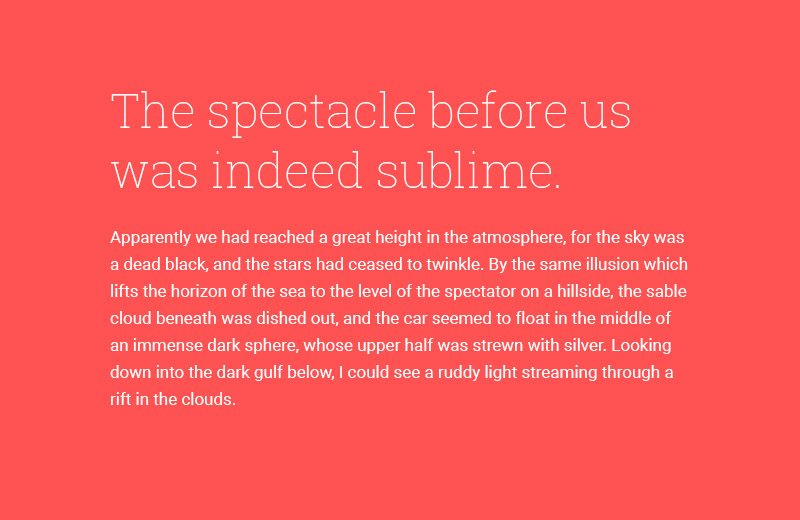
Roboto Slab and Roboto
Another very popular and widely used Google font is Roboto. We really like the versatility with Roboto Slab for headlines, all weights and options can be used in unison with Roboto as a clean modern body font. Just like Open Sans above, Roboto easily pairs well with other fonts.
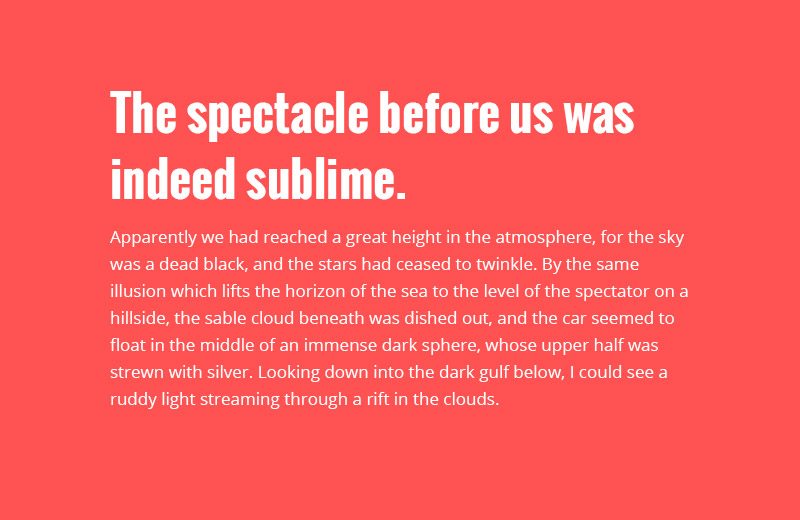
Oswald and Open Sans
Oswald is one of our favorite fonts that gives a more unique look and feel to headlines, we love to contrast title and sub titles with the bold and light options. While it does pair well with a lot of fonts, we have to give the nod to Open Sans for the overall best combination.
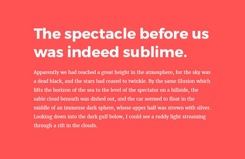
Montserrat and Merriweather
Montserrat is simply a very clean modern font that works perfectly with a minimalist style design and pairing it with Merriweather gives you a nice contrast in font styles that just works well together. Feel free to interchange these two fonts for headlines or body.
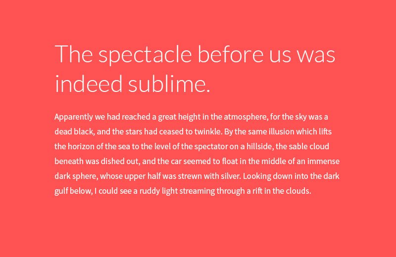
Lato and Source Sans Pro
Lato and Source Sans Pro are are very similar to Monterrat above but they come with a lot more options in styles. So if you need something a little bolder give Lato Black a try or if you’re trying to go thinner give Source Sans Pro Extra-Thin a shot. Either of these fonts also makes for an easy to read option as a body font.
