How to Customize the Facebook Comments Social Plugin on a Static FBML Tab
Adding the Facebook Comments Social Plugin to your Static FBML tab is a slick way to add a level of interaction to your custom tabs. However just like all of Facebook’s Social Plugins the original styling just doesn’t match up with the unique style of most custom tabs. This tutorial will teach you step by step how to customize the Facebook Comments Social Plugin to match your tab’s custom Static FBML design. After completing this tutorial you should be able to play around with the code and make modifications that you see fit to change the styling to suit your own needs.
Step 1: Get Your FBML Comments Social Plugin Code
First things first you need to get the code for your Facebook FBML Comments Social Plugin from Facebook. Your code should look similar to the code below but may look different depending on your settings; for this tutorial we have used the most basic settings. You should also note that the width setting does not work inside of Static FBML and instead Facebook Comments are displayed as a block element.
<fb:comments xid="143389245671476" numposts="10"></fb:comments>
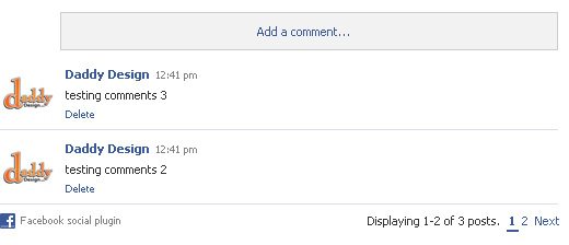
Step 2: Wrap Your Plugin Code with a Container DIV
Now that you have your FBML Comments Social Plugin code you will need to wrap it in a container div to allow for easier custom styling. If you are using multiple comment plugins on the same tab you should use class instead of id.
<div id="comments">
  <fb:comments xid="143389245671476" numposts="15"></fb:comments>
</div>
Step 3: Styling the Container DIV
The next step is to position and add some basic style to the container DIV which will be passed onto the Facebook Comments. You may need to adjust the positioning of the DIV or add some padding/margin to it based on your layout. By setting the font-family and font color as well as the a:href link color on the container DIV we have just passed these styles onto the Facebook Comments, this means almost all text and links will inherit these styles.
#comments {
width: 100%;
float: left;
font-family: Arial, Helvetica, sans-serif;
color: #ff6600;
}
#comments a { color: #ff6600; }
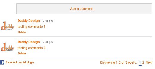
Step 4: Styling the Add a Comment Button
When using the Facebook Comments Social Plugin inside of Static FBML it adds a comment button instead of automatically showing the comment form. One thing we didn’t like about the button was that it didn’t fully stretch across the available width. The following code will fix the button alignment as well as style it. Lines 1–15 will adjust the alignment of the comment button. Lines 16-24 will style the actual comment button. After applying this code you will notice that the comment form alignment is off, don’t worry that’s perfectly normal at this point, we will fix that in the next step.
#comments .wallkit_form {
padding: 0 0 15px 0;
margin: 0 0 10px 0;
border-bottom: 1px solid #ff6600;
}
#comments .wallkit_form .composer { padding: 0; }
#comments .pas { padding: 0; }
#comments .uiBoxGray {
background: none;
border:0;
}
#comments .toggleform {
margin: 0;
padding: 0;
}
#comments .toggleform a {
display: block;
font-size: 14px;
color: #fff;
font-weight: bold;
text-transform: uppercase;
background: #ff6600;
padding: 10px 0;
}
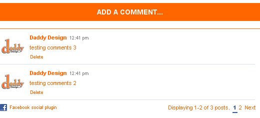
Step 5: Styling the Comment Form
The next step is to fix and add some style to the comment form. Lines 1-8 will adjust the alignment of the form as well as style the form’s textarea. Lines 9-14 will style and adjust the check box for posting the comment to the user’s profile. After applying this code the comment form will now be perfectly aligned with the user’s avatar.
#comments .wallkit_form div.text_spacer { padding-left: 60px; }
#comments .wallkit_form textarea {
display: block;
height: 42px;
color: #ff6600;
margin: 0;
border: 1px solid #ff6600;
}
#comments div.connected input { margin: 5px; }
#comments div.connected label {
font-size: 11px;
color: #ff6600;
vertical-align: text-top;
}
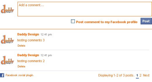
Step 6: Styling the Comment Form Post Button
The next step is to style the ‘Post’ button; this step is a little bit difficult because there are many different classes and states being applied to the button. All of the code below is used to style the button and after applying this code your ‘Post’ button should now be styled.
#comments .uiButton,
#comments .uiButtonSuppressed:active,
#comments .uiButtonSuppressed:focus,
#comments .uiButtonSuppressed:hover {
background: none;
padding: 4px 10px;
}
#comments .uiButtonConfirm{
background: #ff6600 !important;
border: 0;
}
#comments .uiButton .uiButtonText,
#comments .uiButton input {
text-transform: uppercase;
padding:1px 0 2px 2px;
}
#comments .wallkit_frame .inputsubmit-disabled {
background: none;
border: 0;
color: #ff6600;
}
Step 7: Styling the User Comment
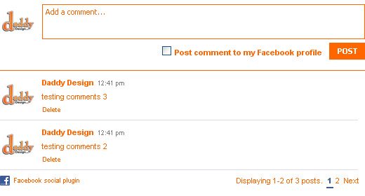
Now that our comment button and comment form are custom styled, the next step is to move onto styling the actual user comments. This step is very simple since we have already applied a base for our custom styling to the container DIV in Step 3. Lines 1-4 will adjust the color of the comment’s bottom border as well as adjust its margin. Lines 5-7 will style the user’s comment date.
#comments .wallkit_post {
border-bottom: 1px solid #ff6600;
margin: 10px 0 5px;
}
#comments .wallkit_post .wallkit_postcontent h4 .wall_time {
color: #ff6600;
}
Step 8: Styling the Comment Navigation
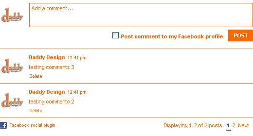
Now that our comment button, comment form and user comments are all custom styled the final step is to style the comment navigation. Lines 1-3 will style the comment navigation information and lines 4-12 will style the actual comment navigation links. In order to see all aspects of the comment navigation you must make sure that there are enough comments in order for the navigation elements to be displayed. Try adding a few test comments and adjust the number of comments to show just for testing purposes, you can delete the test comments and reset your comment number after testing is complete.
#comments .wallkit_subtitle { padding: 3px 0; }
#comments .wallkit_subtitle .post_counter { margin: 0 0 0 5px; }
#comments .wallkit_subtitle .pager { padding-left: 5px; }
#comments .pagerpro .current .pagerpro_a {
color: #ff6600;
border-bottom: 2px solid #ff6600;
}
#comments .pagerpro .pagerpro_a:hover {
background: #ff6600;
border-bottom: 1px solid #ff6600;
text-decoration: none !important;
}

Complete CSS Code
Below is all of the css code from Step 3 – Step 8 combined together.
#comments {
width: 100%;
float: left;
font-family: Arial, Helvetica, sans-serif;
color: #ff6600;
}
#comments a { color: #ff6600; }

#comments .wallkit_form {
padding: 0 0 15px 0;
margin: 0 0 10px 0;
border-bottom: 1px solid #ff6600;
}
#comments .wallkit_form .composer { padding: 0; }
#comments .pas { padding: 0; }
#comments .uiBoxGray {
background: none;
border:0;
}
#comments .toggleform {
margin: 0;
padding: 0;
}
#comments .toggleform a {
display: block;
font-size: 14px;
color: #fff;
font-weight: bold;
text-transform: uppercase;
background: #ff6600;
padding: 10px 0;
}

#comments .wallkit_form div.text_spacer { padding-left: 60px; }
#comments .wallkit_form textarea {
display: block;
height: 42px;
color: #ff6600;
margin: 0;
border: 1px solid #ff6600;
}
#comments div.connected input { margin: 5px; }
#comments div.connected label {
font-size: 11px;
color: #ff6600;
vertical-align: text-top;
}

#comments .uiButton,
#comments .uiButtonSuppressed:active,
#comments .uiButtonSuppressed:focus,
#comments .uiButtonSuppressed:hover {
background: none;
padding: 4px 10px;
}
#comments .uiButtonConfirm{
background: #ff6600 !important;
border: 0;
}
#comments .uiButton .uiButtonText,
#comments .uiButton input {
text-transform: uppercase;
padding:1px 0 2px 2px;
}
#comments .wallkit_frame .inputsubmit-disabled {
background: none;
border: 0;
color: #ff6600;
}

#comments .wallkit_post {
border-bottom: 1px solid #ff6600;
margin: 10px 0 5px;
}
#comments .wallkit_post .wallkit_postcontent h4 .wall_time {
color: #ff6600;
}

#comments .wallkit_subtitle { padding: 3px 0; }
#comments .wallkit_subtitle .post_counter { margin: 0 0 0 5px; }
#comments .wallkit_subtitle .pager { padding-left: 5px; }
#comments .pagerpro .current .pagerpro_a { border-bottom: 2px solid #ff6600; }
#comments .pagerpro .pagerpro_a:hover {
background: #ff6600;
border-bottom: 1px solid #ff6600;
text-decoration: none !important;
}

#comments .wallkit_subtitle { padding: 3px 0; }
#comments .wallkit_subtitle .post_counter { margin: 0 0 0 5px; }
#comments .wallkit_subtitle .pager { padding-left: 5px; }
#comments .pagerpro .current .pagerpro_a {
color: #ff6600;
border-bottom: 2px solid #ff6600;
}
#comments .pagerpro .pagerpro_a:hover {
background: #ff6600;
border-bottom: 1px solid #ff6600;
text-decoration: none !important;
}
Please Note:
After applying the last and final step, your comments should now be completely styled to match your custom tabs styling. Please note that in order to simplify this tutorial and avoid confusion we have applied basic styling to the comments. Please do not leave comments asking how to achieve more complex styling, if you need more complex styling please contact us here in order to receive a quote.
This tutorial will only work when using the Facebook Comments Social Plugin inside of a Static FBML tab on a Facebook fan page.
Troubleshooting
If you are trying to edit the css and no changes are showing up, make sure that you do not have any other overriding styles attached to the container DIV.
If you are having problems getting this tutorial to work please reread the tutorial and try again, if you still can not get it to work please leave us a comment below and we will respond as soon as possible.
Updates
10/28/2010 – Step 4 – Line 8
Facebook changed css class .gray_box to .uiBoxGray